Where do you send your traffic to?
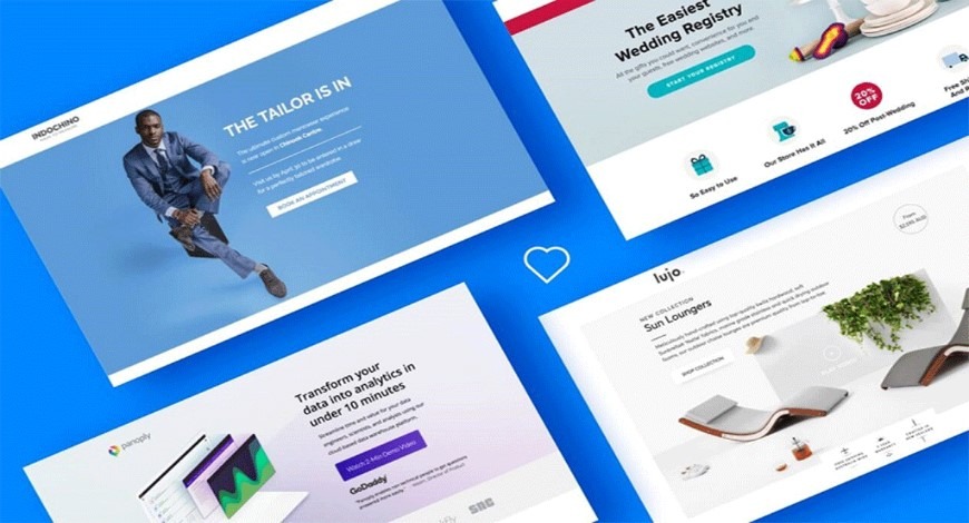
The first contact a user has with your business is likely to be through the landing page. Now you may ask; what is it?
It is the first page that appears when a user clicks on your ad or link that brings them onto your site.
First impressions are crucial, we all know it. It can last a lifetime. It can change a man’s life. It can set the tone. So where do most businesses direct their users to?
The Homepage.
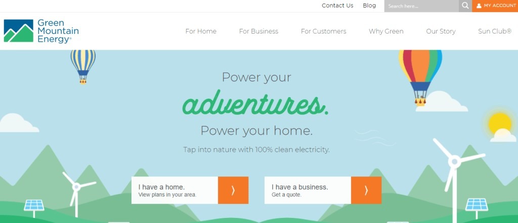
Unless you have a 1-page website, that’s the last place you want to bring them. Yet so many businesses make this mistake, it is costing money, and they will keep bleeding money until they understand how to get their advertising dollars working at optimal power.
When you bring a guest to the house, the first place he or she steps on is the living room. That’s equivalent to the homepage of your website.
You might ask; what’s wrong with it then? Everything!
The users who visited your site are not like house guests, they come to you for a problem, and they want it fixed. They want your solution. That is why they searched online and saw your ad.
They don’t care about your homepage. They want to know that you can address their problems. They want your expertise, they want to seek your advice, your handiwork, or whatever you are selling.
Every ad should be filling a need, and that need comes from your user.
As a late marketing guru once said:
“People don’t buy quarter-inch drills, they buy quarter-inch holes.”
That is something you have to keep in mind whenever you are advertising.
Users have a problem, maybe an urgent one. So that may have commercial value.
Maybe it’s only a question, so that’s an informational query, not so much intention to convert (turning into a sale), but if your landing page can give them clear and concise answers, they might turn into a customer next time.
Informational queries (people googling to find information with no intent to buy as of now) make up 80% of all search queries. You will be missing out if you are not trying to help this large group of users.
What is the first thing a user sees on your landing page? If that’s a white box asking for their email or credit card details, that will be a pretty rude greeting.
Instead, what you must quickly provide is this: THE ANSWER!
And your answer better be good, as you have a few seconds to keep them interested before they click the ‘back’ arrow and bounce!
If somebody is googling for ‘broken iPhone repair’, and your landing page goes in detail about android repair services and screen replacements, with a ‘contact us now’ after the scroll, that’s a bad idea. It doesn’t help them.
The Structure of your Landing Page
If somebody lands on your page and is faced with an intimidating 2-page length form asking for their contact information, they will probably give up.
If your landing page has no structure and navigation and instead leads your users to a dead-end cliff, you become toast.
Conversely, if your landing page gives users too many options, that will cause information paralysis, they won’t be able to do anything. If your landing page is like a road with 20 directions, nobody knows where to go, you shouldn’t expect your customers to know as well. You become toast as well.
So what happens when any of the above happens? Your potential customer clicks the ‘Back’ arrow, that’s a bounce. Which means you just wasted ad dollars!
A landing page with a high bounce rate essentially means your customers are not engaged, do not answer their questions, and they do not think you can help them at all.
Your ad copy might be good, but what is the point if your landing page fails to bring any conversion!
If you are a business and reading this: re-design your landing page. Reread this post if you have to, it will save you a lot of marketing dollars in the long run.
Set a clear call to action. Make sure your landing page mirrors your ad copy and the searcher’s query to the best of your ability.
You want them like domino blocks, all aligned in a straight line. We believe, at any point when there is incongruence between the user’s query, ad copy, and landing page, there is potential that your customer will bounce off your site.
Google is playing by one main rule and that’s relevancy.
Google wants relevancy
It is like putting up a stall selling the best apples in town then proceed to pitch your users about pineapples.
Even though that is a slight exaggeration, it happens more often than you think in marketing.
(As of typing right now I did a quick search for a facial clinic and found that the top-ranking ad actually had a broken landing page. Back to the fruit analogy, they advertised an apple and tried to sell me, well, nothing.)

Broken landing page, anyone?
If your competition is also making any of these costly mistakes, it is your time to make the jump and re-think your pages.
If you are trying to expand your business, and you shouldn’t be making these pesky mistakes. Clean it up so you can set your focus on winning the battles that matter.
