What is a landing page?
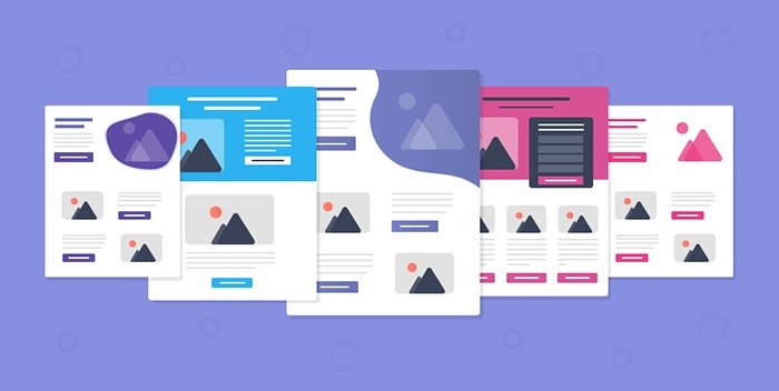
Your PPC landing page is the page a visitor arrives at on your website after clicking your ad, whether it’s a text ad in the Google search results or a banner ad placed on the display network.
What happens after your ad successfully convinced the user to check you out? You either get a new lead or an unpleasant bounce off your site.
What determines whether or not you can get the user to perform a valuable action on your website? (aka conversion) Well, it’s your landing page. If you are a business owner and you think; if I just get 1000 relevant traffic into my website today, how wonderful would that be?
Well, if all 1000 of them click through your ad, gets on your page, then leave after 5 seconds and goes on to their daily life, that’s not good.
2 reasons. First, they didn’t interact with your business at all. Second, you paid for those 1000 clicks that led to nothing!
Here’s where optimized landing pages come to save the day. It’s the heavenly gateway that seals the deal for your business.
Inexperienced marketers often direct all of their PPC traffic to their homepage, but this is a gigantic mistake.
Specific landing pages tailored to different offers are essential for providing a quality experience for visitors and driving conversions with a targeted message that matches each user’s needs.
But first things first.
What is your goal?

Ask yourself this when creating a landing page. A landing page must have a definite purpose because this is where you pull your traffic in and encourage them to do something.
Something that is beneficial for your business. This goal is something that your business values.
Want to build an email list? A form fill up? To buy something? What is it that your business wishes to accomplish?
Next, ask:
Who is your audience?

You can’t be selling to everyone in the world. So what is your market segment?
Who exactly is your audience, or your target users? What is the general demographic of your customers? After all, we are still communicating with humans, if you write a copy that doesn’t connect with people that it won’t sell. No matter how beautiful your page looks. Being able to speak your customers’ language and think from their needs is a sure way to encourage them to take action on your site.
Close your eyes for a minute and imagine yourself as your own customer. You are clueless and looking for help, you stumble upon an ad and clicks on it. Now draw out the landing page in your mind, as vividly as you can, that you would like to encounter.
Usually, the more landing pages you have, the better your conversions. Why? Because the more landing page variety you have, the more specifically tailored the page is to your ad copy, and that’s a plus. If your competitor is driving all his traffic to one page and you are splitting into 5/6, you are probably in the lead. (my claim, no guarantee!)

Use multiple landing pages
By having more landing pages you are A/B testing more. Which means you know which works and which doesn’t, and what to optimize and what to drop off. While your competitor thinks that he has the best 1 landing page in the world!
Let’s have an example. You are a plumbing company. You repair the toilet and the kitchen, ideally, you want to have 2 landing pages for each service and not 1 page that talks about 2 services. So when your customers looking for 2 different needs they get served separately.
But you can overdo it, and you definitely don’t want to. Let’s say in the toilet you fix the sink, tap, pipes, and bidet. You wouldn’t necessarily create 4 different pages for each of them and you will group some of them together as related themes.
Let’s jump forward and say you created a basic landing page for your business.
What’s next?
These checklists will help you confirm that you have the best possible landing page as of now. (you still have to do tests though)
1. Get short and clear!
I have written another post about clarity and how many businesses today are simply missing it. You certainly have to read it! A landing page should offer all the necessary information, but not so much as to overwhelm (and as a result, drive away) the visitor. Provide the essential details relevant to the user’s needs and nothing more.
Lookout and don’t write an essay or philosophical thesis for your users to read.
Provide rich, useful content, as long as it stays relevant!
Far too many landing pages are written with marketing buzzwords and terms lifted straight out of sales training manuals.
This is particularly evident among enterprise-level businesses, many of which seem to think the more indecipherable the language, the better.
However, speaking to customers using their language is far more effective, and will result in much higher conversion rates.
2. Reduce friction!

Human beings have a natural tendency to follow the path of least resistance. To maximize conversions from the traffic you get, make sure whatever you want them to do, make it easy to do. And they will probably do it!
But if your form submission or checkout page is like the great wall of china with a few layers deep, then it’s a pretty easy bounce for the user.
3. Test your CTA.

Calls to action (CTA) can be present in the headline text as well as the button text (for example: “buy now” or “download your free marketing guide”). There should be no question as to what next steps are necessary – tell your visitors exactly what you want them to do in big, bold text.
Big, action-packed words are known to perform better than dull, boring words for the CTA.
4. Headlines & copy
The Headline is really a big thing, be it in ad copy and landing page. The headline is the focal point of the entire copy. You might screw the description up but never, ever mess up the headlines! It’s what everybody reads first!
Good landing pages use the main headline to confirm the offer and use a subheading for more explanation or value proposition. The headline should state that “Yes, my landing page is very relevant to you.” It will be better if it has the keywords that the user was searching for.
For the body copy of the page, it should stay relevant and talk about how your product/service can help your users with their problems. Use your audience language and not your technical jargon. Write in simple words that are understood by a 12-year-old.
5. Have conversion tracking installed
Set up conversion tracking so you know how well your page is converting for you. Many businesses do not do that. They send an ad to their website and hope for the best. You don’t want to shoot money in the dark. With conversion tracking, you know how much you are spending to obtain every lead.
In summary
There are many ways to build a high-converting landing page. There is probably another 50 steps, there are numerous books written on it. But if you can perfect these few well you are well over 80% successful! Keep testing different variants of the page and keep the successful version. Test from the forest before you test the tree.
This means testing the headlines before you test what CTA button color to use. (orange and green seem to perform better!) The big factor takes priority over the minor details of your page!


